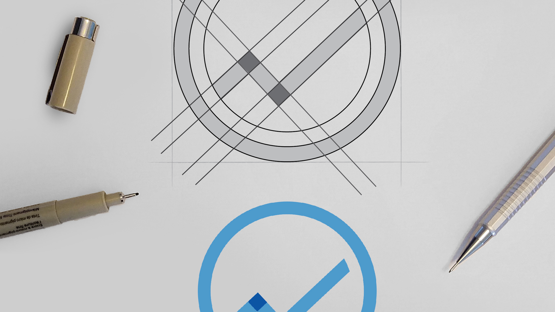
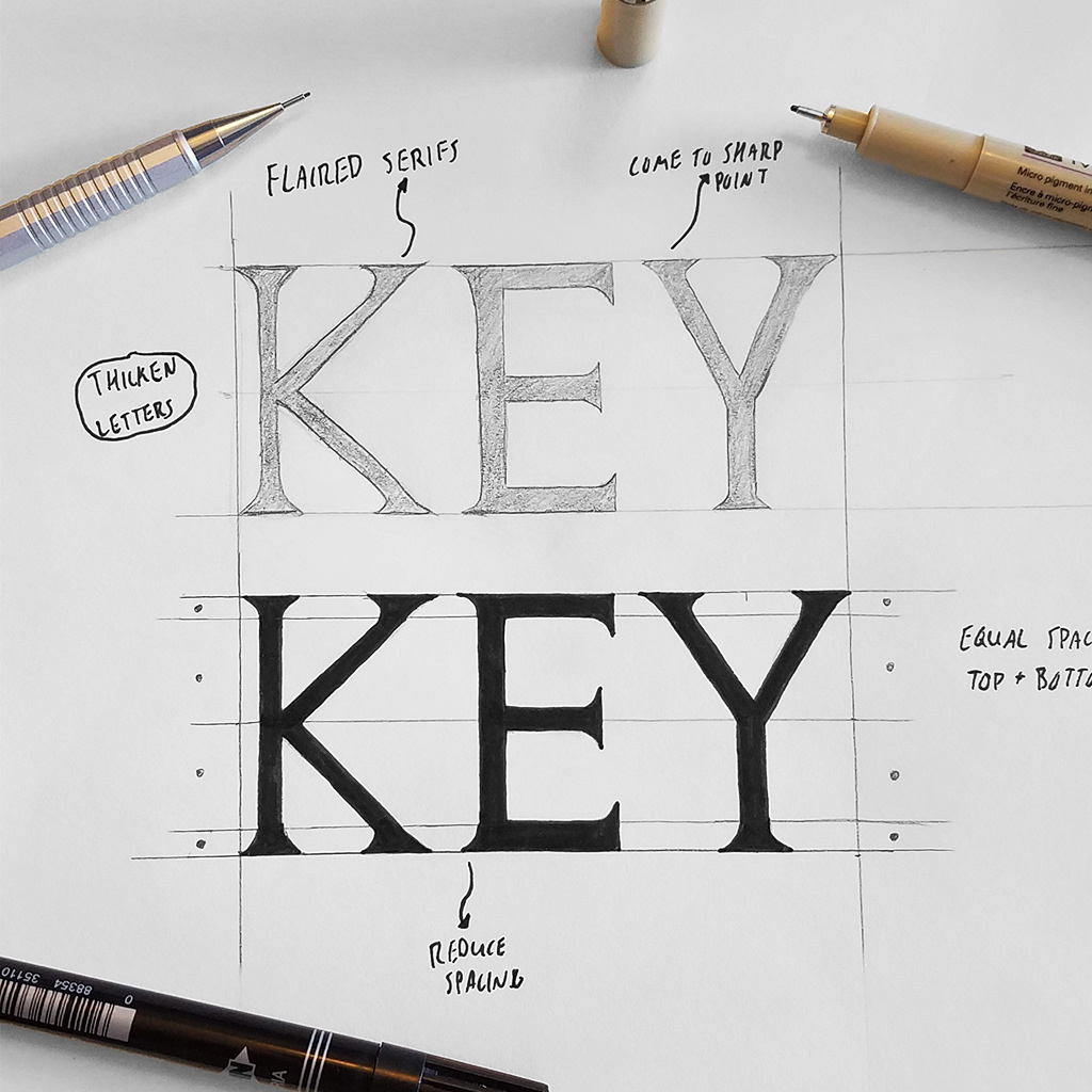
Some of my initial sketches once a layout/style was selected.
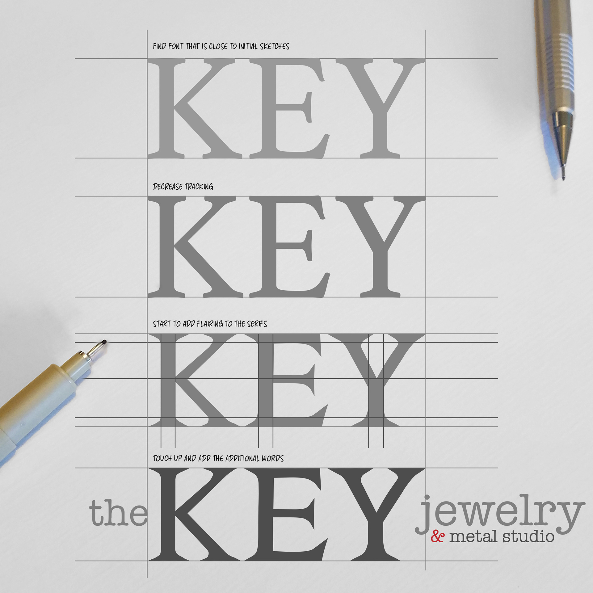
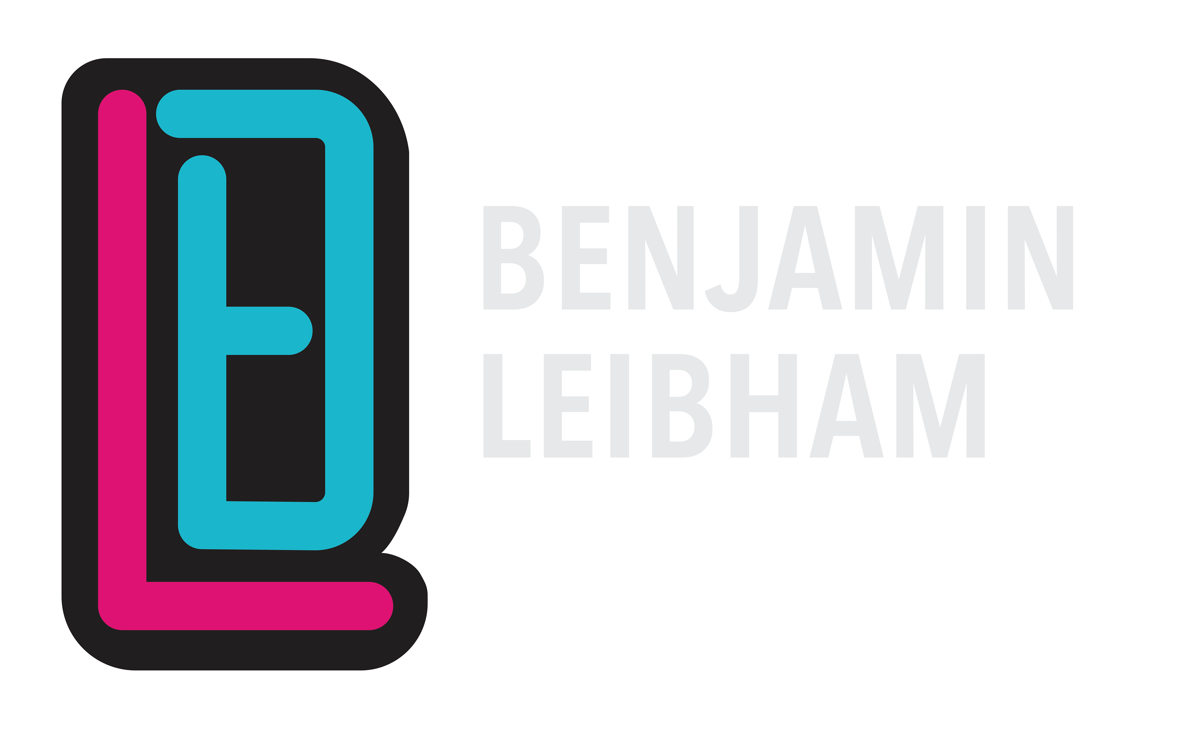
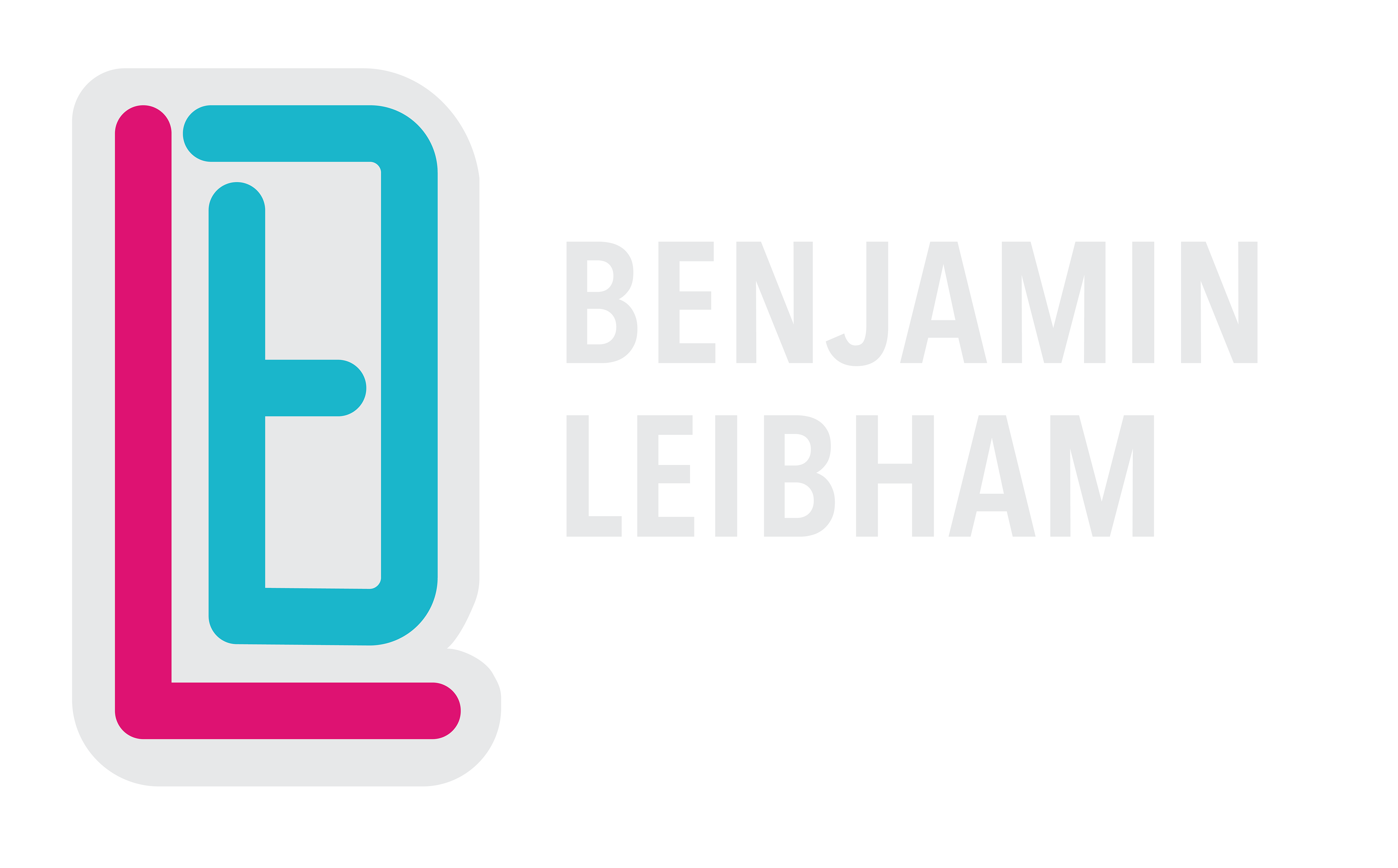
Here is step-by-step guide of how I created the custom font for the word "KEY" and the final additions.
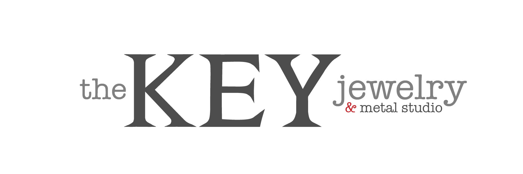
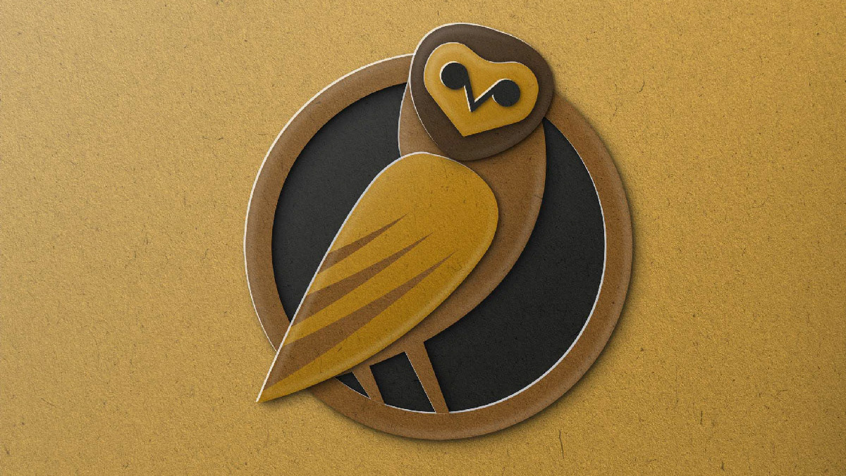
The final logo given to the client.
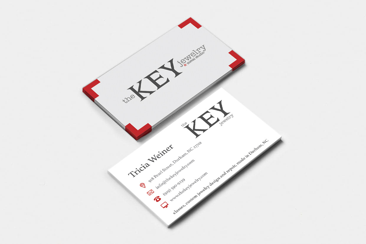
I was contracted to redesign and rebrand for a jewelry studio based out of North Carolina. Working closely with the client, we wanted the logo to be text-based but incorporate the industrial/edgy feel that comes with a metal studio. I designed a custom font with flaired and pointed serifs to convey that feeling. Lastly, I designed new business cards and website banners for the client as well.
Some of my initial sketches once a layout/style was selected.
Here is step-by-step guide of how I created the custom font for the word "KEY" and the final additions.
The final logo given to the client.